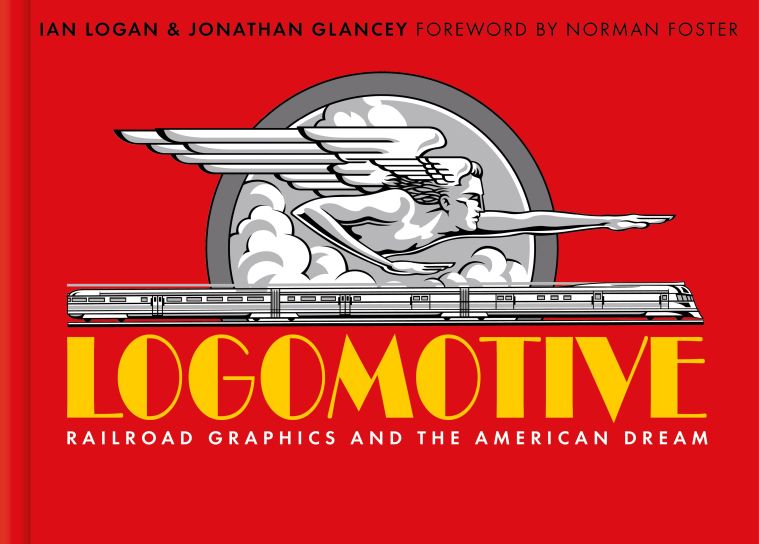
Meet Ian Logan and Jonathan Glancey, authors of Logomotive – Railroad Graphics and the American Dream; a delightful visual tribute to the heyday of US railroad graphic.
Welcome, Ian and Jonathan,
Your careers to date are as colourful as the posters in your beautifully crafted book. What was the spark that ignited your passion for this project?
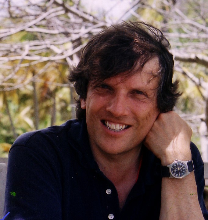
Jonathan:
Ian’s photographs of US trains – their logos, liveries, if sometimes dishevelled appearances – before so many American railroads were either closed or swallowed up by less characterful corporate giants from the 1970s.
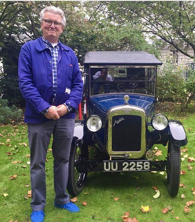
Ian:
I have had a love for visual decoration for as long as I can remember. When I was very young I would stand outside the tobacconist’s shop in my village admiring the wonderful designs on the cigarette packs and cards. I still have a large collection of the cards.
Then when I first went to the US and saw “Americana” and my first US train with “Rock Island” on the side I was in heaven!
Did your love of the marketing designs, created to sell the dream image, capture your interest first or did that come out of a passion for trains and the history of the railroads?
Jonathan:
A fascination with trains, their looks, sounds and their habitat – stations, goods yards, viaducts, distant hills and engine sheds – before uncovering the history of railways themselves and how their services have been created for and sold to the public over the generations.
Ian:
I have always loved machinery, especially steam locomotives. I was an apprentice in a company that made parts for the railways. I also have a love of old aircraft. For me it is the power, colour, speed, and visual excitement that is the passion.

3. Was it your mutual love of design, or for the actual locomotives and the networks, that brought you together on this project?
Jonathan:
Design, yes. I hadn’t known that Ian was quite so keen on trains and railways as I am. I was a regular customer of the delightfully eclectic design shop he ran near Smithfield Market in the City of London.
Ian:
Design is the inspiration, without doubt. I had read and knew about Jonathan from his articles and he used to come into my design store. He was the most obvious person to collaborate with.
4. Do you still travel extensively on the networks and do have a favourite older locomotive that still operates in the US?
Jonathan:
I would love to travel again post-Pandemic! My favourite operational US steam locomotive is No 611, a very powerful, very fast and ultra-reliable glossy black, Indian red and gold-lined streamlined J-class 4-8-4 built in 1950 to pull Norfolk and Western Railway long-distance passenger trains like the Powhattan Arrow from Norfolk, Virginia to Cincinatti, Ohio. No 611 is as muscular as a heavyweight boxer yet as lithe as a marathon runner.
Ian:
I have travelled on the network and would love to travel again. It’s a sensational way to view the country.
I loved the designs of the GM. E and F unit diesel locomotives and their paintwork and liveries of the different railroads. I also have a love of the design functionality of modern US freight locos.
![]()
5. Do you have a bucket list of ‘must see, visit, or find’ regarding the trains, lines or graphics?
Jonathan:
I’d really like to ride with the engineer and fireman on the footplate of the Union Pacific’s “Big Boy” No 4014, as, freshly restored to service eighteen months ago, this compelling black and anthracite liveried mobile thunderstorm tackles the mountainous route between Utah and Wyoming, its mournful whistle resounding through twisting passes, its train ideally at least a mile long.
Ian:
I would love to ride in the cab of Union Pacific’s 600 ton 4-8-8-4 “Big Boy”.
I flew to LA before lockdown to see Big Boy while it was touring the western states for the Centenary of ‘The golden spike’. You could not but be in awe of the sheer size and power.
6. Do you have a favourite design – or designer’s work, that stands out for you?
Jonathan:
Henry Dreyfuss’s design of the New York Central’s peerless 20th Century Limited overnight express that ran from New York to Chicago from 1938, a masterpiece of cocktail-era Streamlined Modernism, and Paul Kiefer’s design of the cinematic silver and grey Class J3a locomotives that speared this supremely glamorous train between the two great American cities.
Ian:
There are a bunch of designers, illustrators and artists that I have admired over the years. Milton Glaser is way up there for originality and sheer inspiration. Pentagram design group for their original philosophy.
Raymond Loewy for his design styling of the Pennsylvania railroads S1 steam loco. And his design for the beautiful Greyhound Scenicruiser bus and logo.


7. How much has your own work and designs been influenced by this golden age?
Jonathan:
I’ve written about US locos and trains in my books Giants of Steam (2012) and The Journey Matters (2019). I show them in talks and lectures about architecture and design, too.
Ian:
Within the design group I had during the 60s to the late 90s it has always been there in the background.
8. Since John Bull trains have come a long way, do you find they have lost or gained appeal to you?
Jonathan:
Most contemporary trains, however efficient, are anodyne and all but generic in terms of design. They could belong anywhere. There is no sense of place about them. Steam locomotives, whether shunting wagons in small yards or racing with restaurant car expresses are never less than alive. They have an elemental quality, a rhythmical one, too, that has never been replaced, much less bettered by later machinery. They belong to the townscapes and landscapes they inhabit.
Ian:
There was a time when the competition created all different trains and that excited thousands of young boys taking their numbers on stations all over the country but now they all look the same!
9. Are there any designs that you have not managed to track down that you would like to collect? Do you collect originals?
Jonathan:
I’m not a collector. Over to Ian!
Ian:
I have a collection of English railway posters from the 1920s and 30s and love this period of art and illustration. There is one poster I would love to own. It’s part of a WW2 series illustrated by the great Frank Newbold titled ‘Your Britain fight for it now’. It shows a shepherd walking over a hill with his sheep and dog with the farm and sea in the distance. I also love the Batsford book jackets by Brian Cook depicting English country scenes.
10. This book is a first, like the first railroad it is a pioneering work. Will there be a ‘Logomotive 2’?
Jonathan:
I think this depends on how many people buy a ticket to ride with Logomotive 1!
Ian:
Jonathan’s answer!
Thanks for sharing your enthusiasm and insights for this beautiful project. I wish you both every continued success for Logomotive and all your future projects.
Thank you for being my guests!
 I am delighted to share an interview with Jan Marshall, the talented book-designer who has created the Valerie Holmes eBook covers.
 The most rewarding time in my career has to be the ten years I spent immersed in the world of movies, creating designed materials for mainly Universal and Paramount films, ranging from huge outdoor posters to video covers and film-based interactive teaching aids for schools. I was privileged (and extremely proud) to work on movies as diverse as: Babe, The Rugrats Movie, Apollo 13, the three Pierce Brosnan Bond movies, The Addams Family Values; Dragonheart, Twister, Twelve Monkeys, and The Mummy. On a more personal note, another highlight came in the shape of a short thank you message. It was from the late, truly adorable Peter Cook, who, having briefed the job to the team in a safari suit and pith helmet, later described my design for the ‘Derek & Clive Get The Horn’ video sleeve as: “…the best I have ever seen on a video pack. I cannot tell you how thrilled I am”. I was thrilled too.